Area Chart
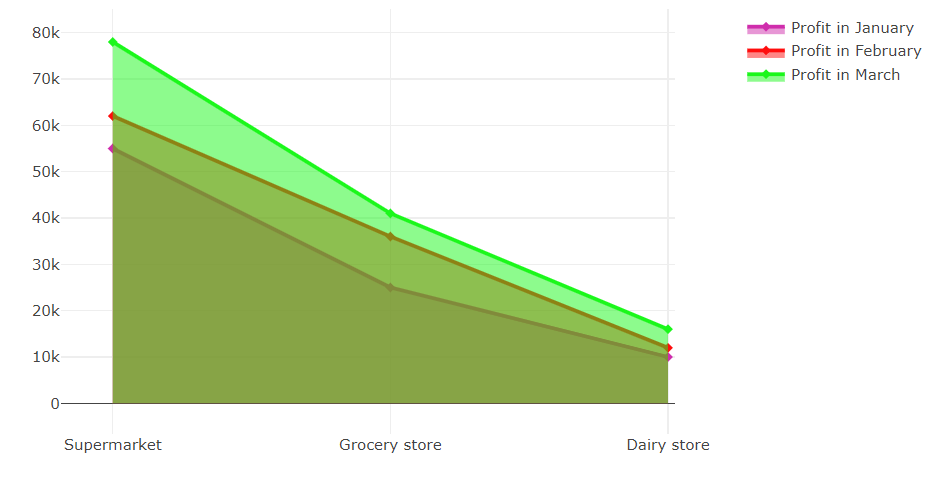
The area chart is created on the base of the line chart. The difference between the line chart and the area chart is that the area between lines in the area chart is colored to indicate the volume. Area charts emphasize the magnitude of change over time. Usually, an area chart is used to show the change in one or more quantities over time. E.g. an area chart can help to study the profits of a chain of shops.
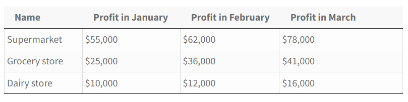
Here is how the data will look in a table.
This is how it’s gonna look in the area chart.
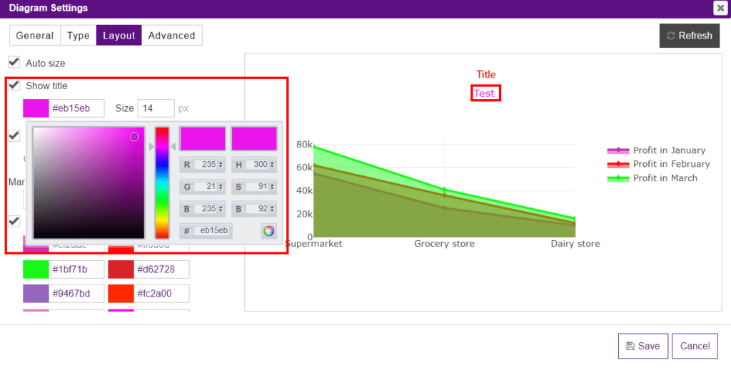
To customize the view of your area chart, you need to proceed to the Layout tab where you can change the color and the size of the title of your diagram(or you can disable it if needed).
If you want a diagram to be auto-sized just check the Auto size option. The Layout tab also allows changing the margins of the diagram (top/right/bottom/left) in the corresponding section.
If you disable Auto size, you can set the width and height in the corresponding field.
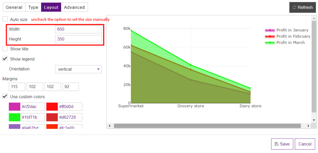
Here you can hide/show the legend, and change its location(furthermore, the location of the legend can be changed easily by dragging and dropping just right in the preview).
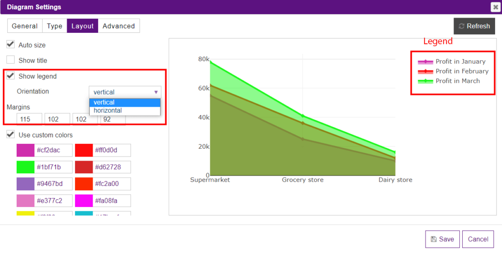
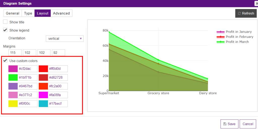
If you check the Use custom colors option, you can set up the desired colors for your chart.
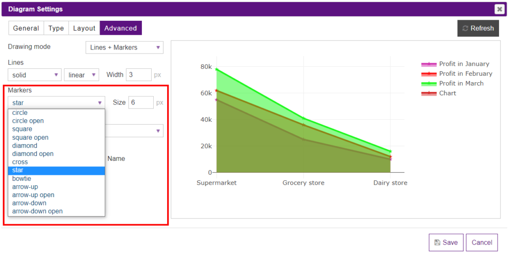
Navigate to the Advanced settings tab to have an opportunity to change the drawing mode of lines. From the Drawing mode dropdown, you may set Lines, Markers, Lines+Markers, or None(available only for the Area Chart).
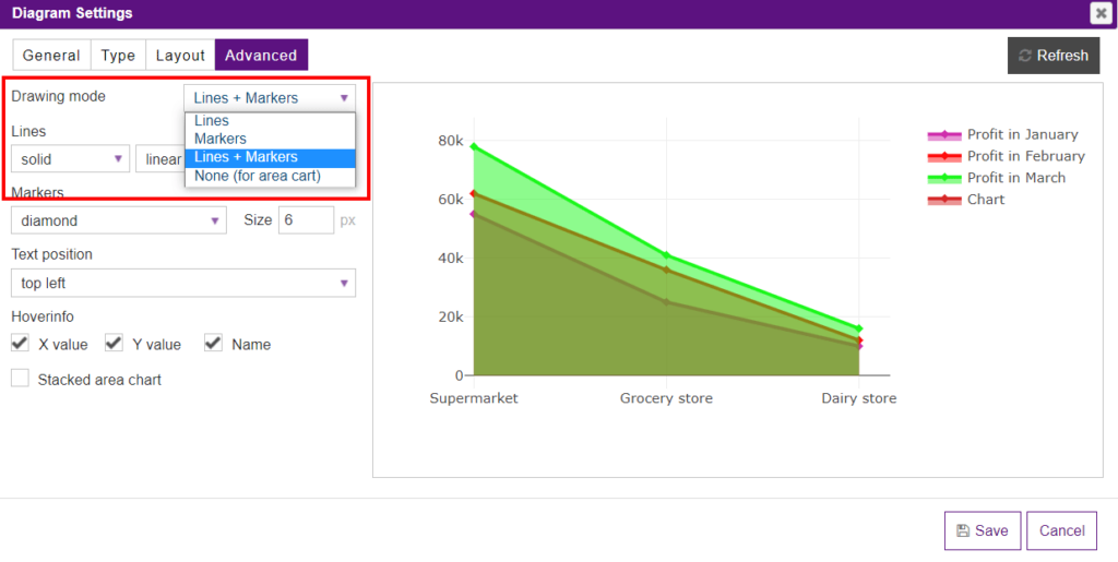
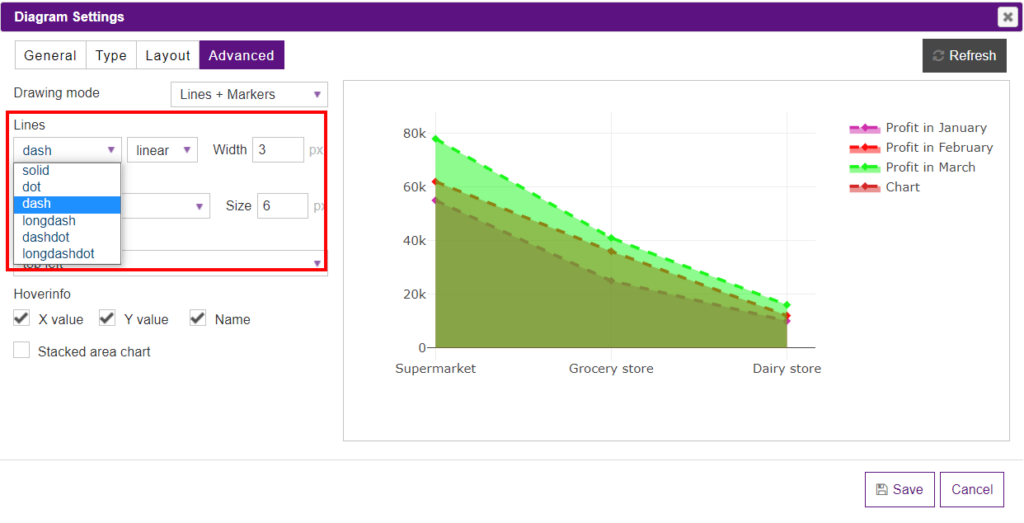
If you decide on the line drawing mode, you can customize them in the Lines section.
The markers mode can be changed in the Markers section.
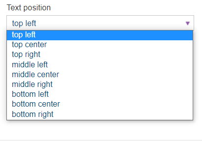
In the Text position dropdown, you can set the positions of the value text elements with respect to the (x,y) coordinates.
In the Hoverinfo section, you’ll see three checkboxes: X value, Y value, Name. By checking them, you determine which trace information appears on hover.
What’s even more, Y-Axis and X-Axis of the diagrams created with the help of the Data Tables plugin can be changed directly in the preview mode by moving them. Moreover, you can change the title of the axis by hovering on it and clicking to set the title.
Besides, you can insert the diagram into the table. To do it, open a table, click on the Extended builder and enable Do shortcodes in the selected cells option. Then copy the shortcode of a diagram and paste it to the cell.