Bar Chart
Data Tables plugin is a great, powerful, and easy-to-use tool to create, manage and embed interactive, responsive diagrams. There are five types of diagrams you can create. Let’s check how Bar Chart works. Bar charts are used to compare things between different groups or to track changes over time.
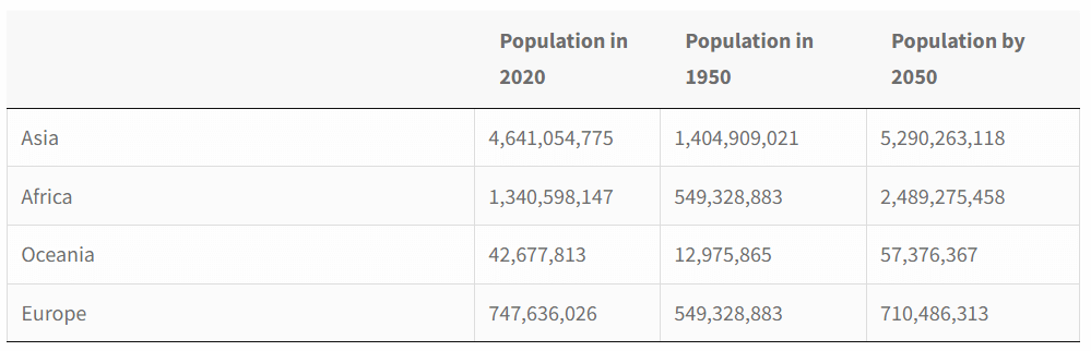
For example, you have to showcase the population changes in particular regions.
Here is the population information.
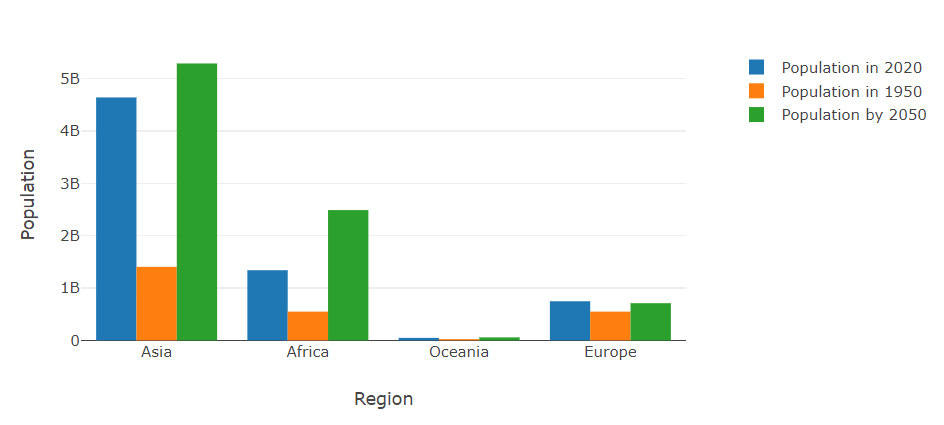
This is how it will be compared in the Bar Chart.
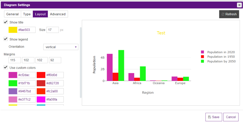
After setting up the bar chart, you have an opportunity to customize its appearance. To do so, you need to move to the Layout tab.
You can enable the Auto size option to automatically set up the size of a diagram or turn off the option and set the size manually in the newly appeared corresponding fields called Width and Height.
You can tick the Show title checkbox and change the color and the size of the title of your diagram. Leave it empty if you don’t want a title to be shown.
You can also show/hide the legend, and change its location(furthermore, the location of the legend can be changed easily by dragging and dropping just right in the preview).
Check the Use custom colors option if there is a need to change the color of the diagram’s items.
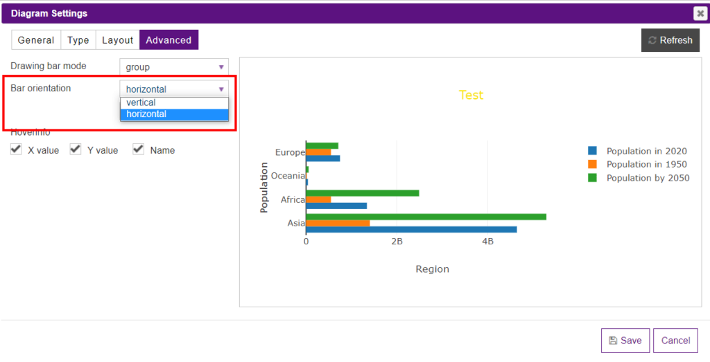
The Advanced tab has some extra options that allow you to set up the items in the bar chart.
The Drawing bar mode option has three bar mode options that determine how bars at the same location coordinate are displayed on the graph.
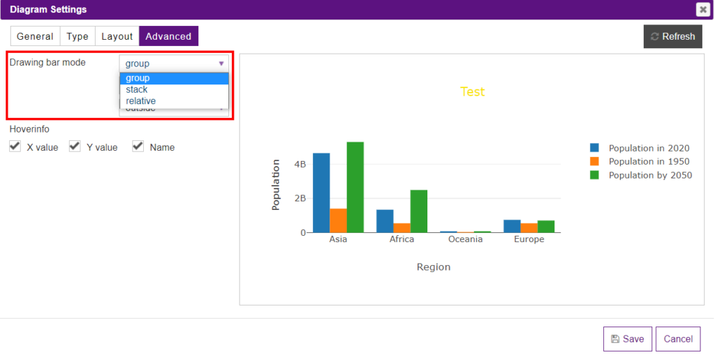
The Stack option stacks the bars on top of one another.
The Relative option stacks the bars on top of one another, with negative values below the axis, positive values above.
The Group option plots the bars next to one another centered around the shared location.
The Bar orientation dropdown allows selecting the alignment of the bars. There could be vertical or horizontal alignments.
In the Bar text position dropdown, you can select whether the text will be inside or outside the bars.
Inside option locate the text next to the bar end (rotated and scaled if needed).
Outside position means that the text is outside, next to the bar end (scaled if needed), unless there is another bar stacked on this one, then the text gets pushed inside.
Auto option places the text inside the bar, but if the bar is too small and no bar is stacked on this one the text is moved outside.
The Hover info section is responsible for the data that will be displayed on the chart on hover. They are X value, Y value, and Name.

What’s even more, Y-Axis and X-Axis of the diagrams created with the help of the Data Tables plugin can be changed directly in the preview mode by just moving them. Moreover, you can change the title of the axis just hover on them and click to set the title.
Besides, you can insert the diagram into the table. To do it, open a table, click on the Extended builder and enable Do shortcodes in the selected cells option. Then copy the shortcode of a diagram and paste it to the cell.