Line Chart
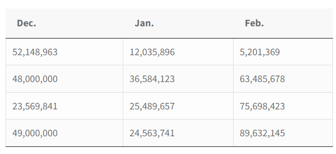
The line chart is a type of chart that displays information as a series of data points connected by straight line segments. It is suitable for representing fluctuations in stocks, the growth rate of a company, building a profitable system, etc. For example, let’s imagine we need to show the growth of the number of users online in the most popular online game World of Warcraft.
Here is the date you need to showcase via a line diagram.
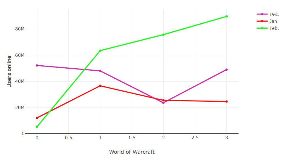
This is how it looks in the diagram.
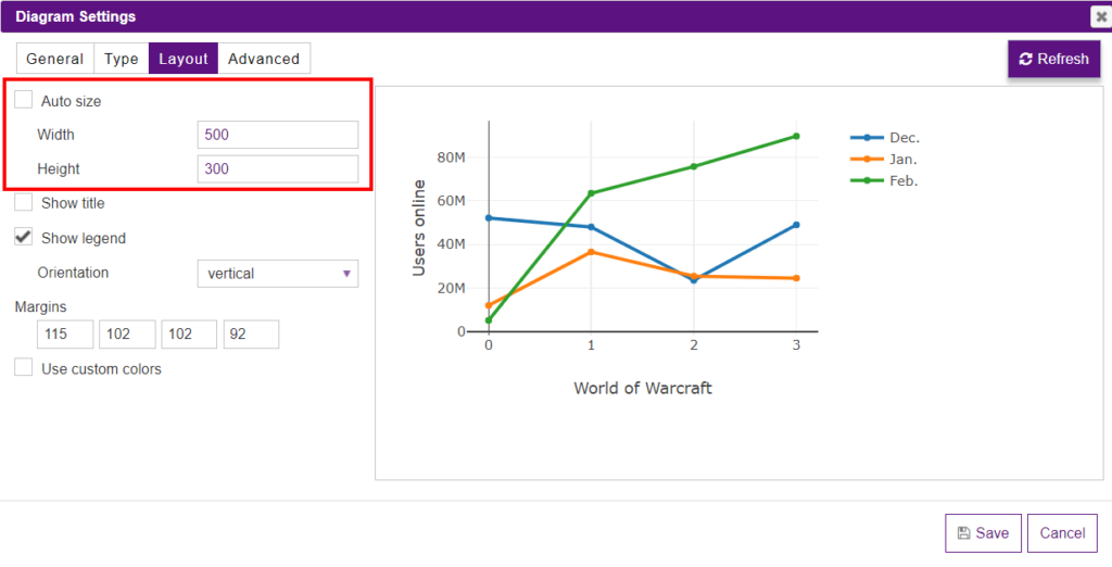
To customize the appearance of a diagram, you need to proceed to the Layout tab where you can set the width and the height of a line chart. Here you can also enable the Auto size option to automatically set up the size of a diagram.
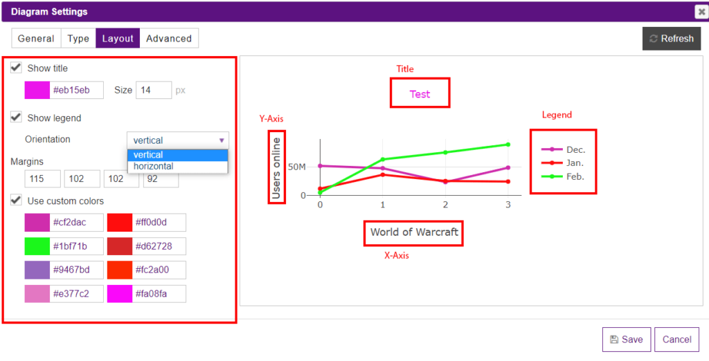
Tick the Show title checkbox if you need a name of a diagram to be on the page (if there is no need to use a title, leave it empty). Change the color and the size of the title of your diagram(or you can disable it if needed).
Here you can hide/show the legend, and change its location(furthermore, the location of the legend can be changed easily by dragging and dropping just right in the preview).
If you check the Use custom colors option, you can set up the custom colors for a diagram.
Go to the Advanced settings tab to change the drawing mode of lines. In the Drawing mode dropdown, there are Lines, Markers, Lines+Markers, or None(available only for the Area Chart).
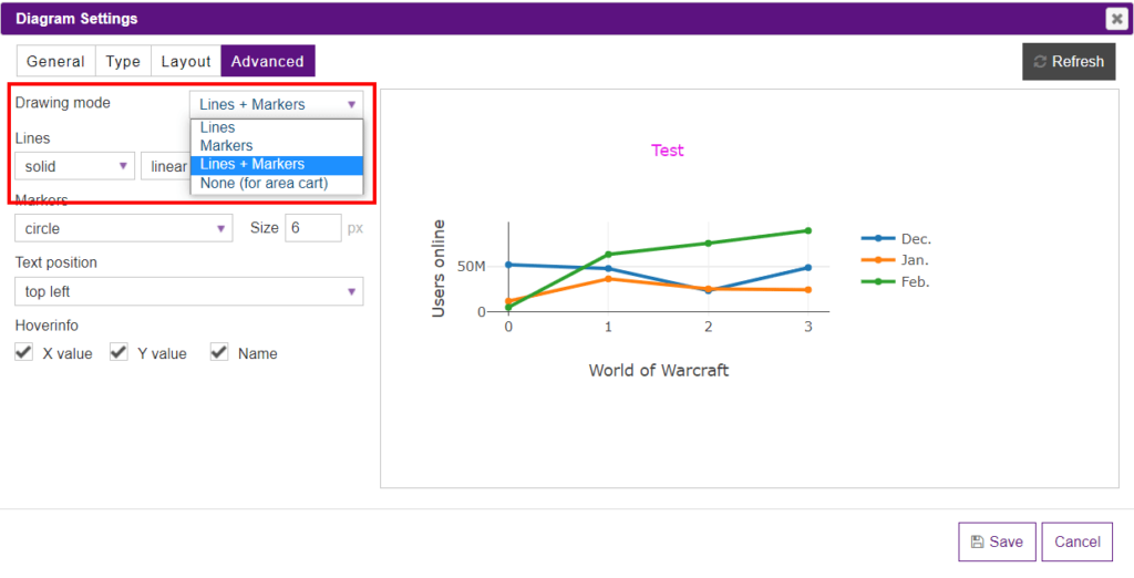
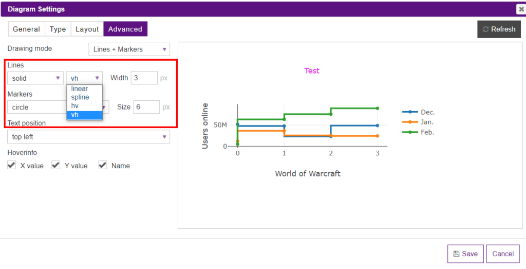
If you decide on the line drawing mode, you can customize them in the Lines section.
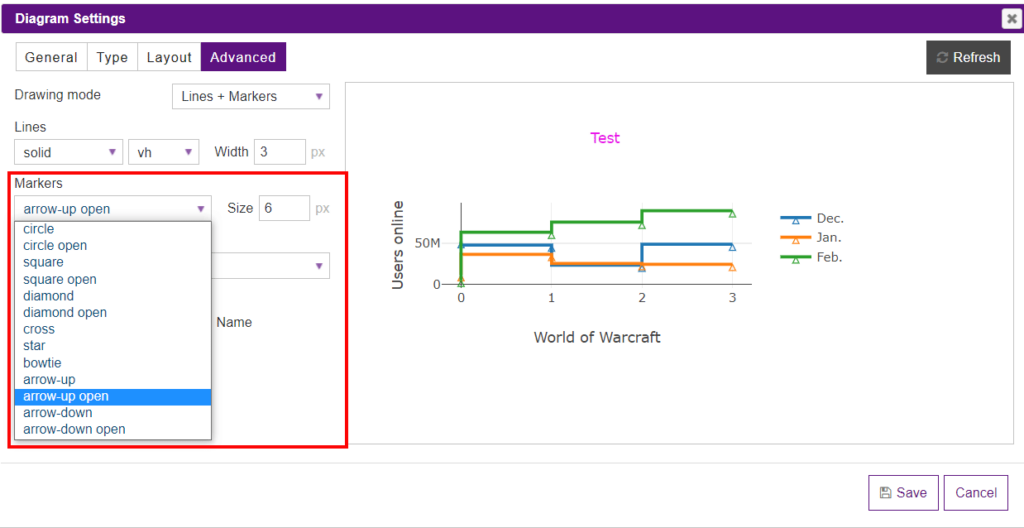
The markers mode can be changed in the Markers section.
In the Text position dropdown, you can set the positions of the value text elements with respect to the (x,y) coordinates.
In the Hoverinfo section, you’ll see three checkboxes: X value, Y value, Name. By checking them, you determine which trace information appears on hover.
What’s even more, Y-Axis and X-Axis of the diagrams created with the help of the Data Tables plugin can be changed directly in the preview mode by just moving them. Moreover, you can change the title of the axis just hover on them and click to set the title.
Besides, you can insert the diagram into the table. To do it, open a table, click on the Extended builder and enable Do shortcodes in the selected cells option. Then copy the shortcode of a diagram and paste it to the cell.