Responsive mode.
Responsive mode is a special mode that provides a nice and proper view of your table on any device: desktops, mobile phones, and tablets. Let’s dive closely into the responsive settings of the Data Tables plugin.
Hidden Columns
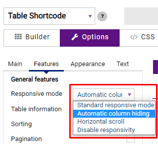
Please note, that columns hiding will work only if you previously enable the Automatic column hiding option. To do so you need to go to the Options » Features section and select it from the Responsive mode dropdown.
While in the Builder section of the Data Tables menu, you can manage which of the columns should be seen on different devices. To do so, you need to click on the gear icon near the title of the column and the new window with additional settings appears. Here from the Responsive breakdowns dropdown, you can select how a column will be shown in the responsive mode.
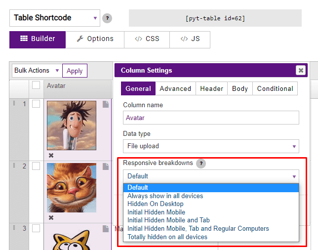
By default, a column is shown on all devices. Always show in all devices option also displays a column on all devices.
Hidden On Desktop – the column is displayed on all devices except desktops. The column will be hidden under the plus sign on the PC.
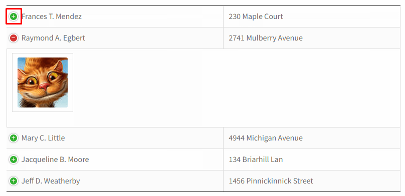
The Initial Hidden Mobile option displays a column on all devices except mobile. In order for a visitor to see the hidden information on the mobile, it is needed to click on the plus sign.
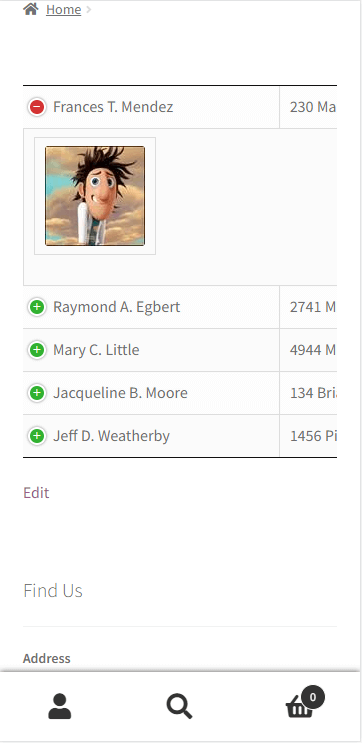
The Initial Hidden Mobile and Tab option displays a column on all devices except mobile and tabs. To open the data on a tablet or mobile, a user has to click on the plus sign.
The Initial Hidden Mobile, Tab and Regular Computers option allows hiding a column data on each device and makes all the info available under the plus sign.
The Totally hidden on all devices option hides a column on all devices without an opportunity to see the data.
Responsive mode
If you go to the Options tab and scroll down to the General feature section, you’ll get another couple of responsive settings for a table.
If table content doesn’t fit all columns become under each other with one cell per row then Standard Responsive mode is set.
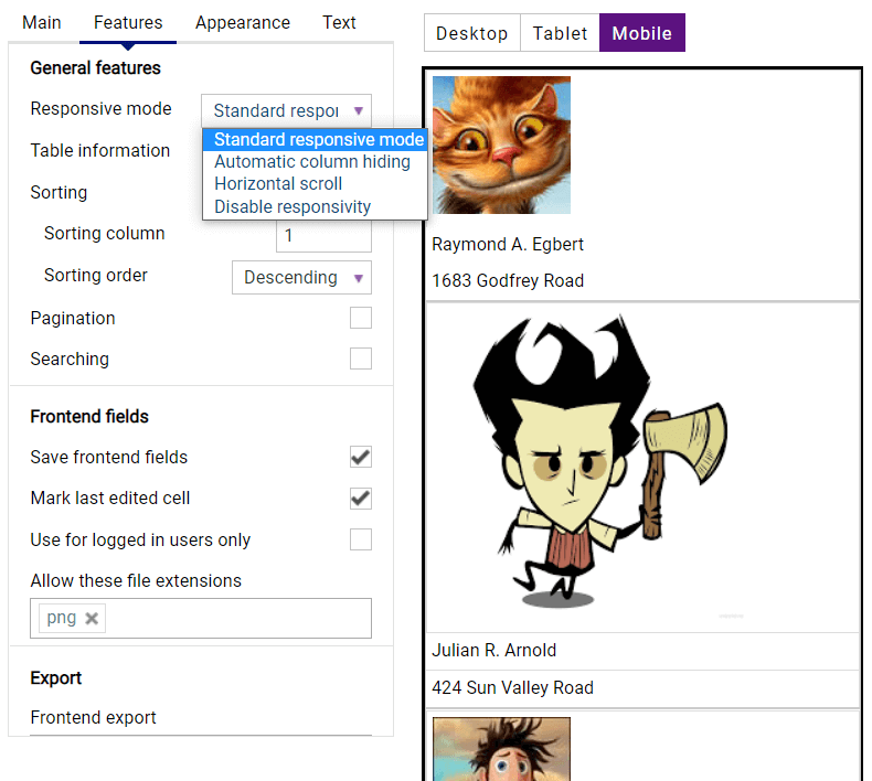
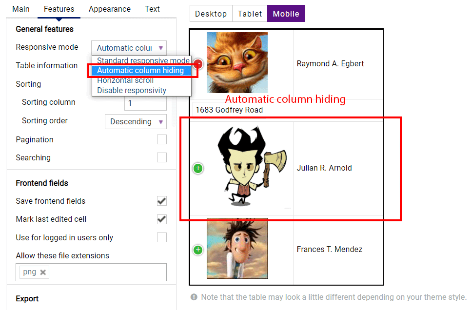
If you select the Automatic column hiding option the table columns will collapse from right to left if the content does not fit to parent container width.
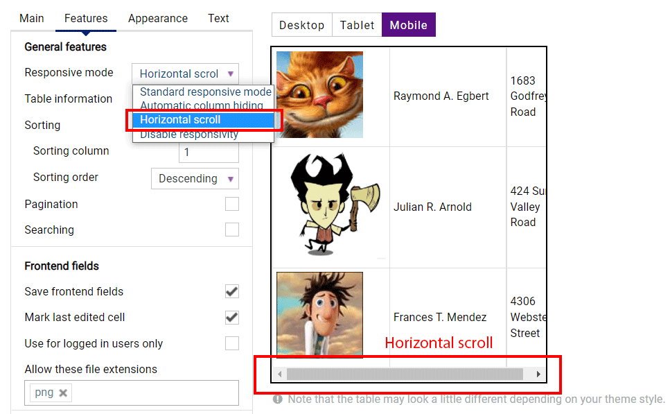
The Horizontal scroll option will create a scroll bar if the table overflows the parent container width.
If you choose the Disable Responsivity mode the default table fluid layout will be applied.