Tables are a great way to organize statistics data for a better understanding of the information. They make a user involved in a specific field. Large tables are displayed well on traditional computer screens, however, there could be some adaptive issues using apps with smaller screens.
The information in tables needs a space for proper displaying because they can not dynamically adjust to any screen. Previously the only solution was to use a code, however, WordPress is developing rapidly so now all the plugins made for WP had responsive options thus saving you from digging into the code.
If tables are adapted as any other elements in your website, you ensure to receive positive feedback. This article will discuss what it means to have responsive tables. It will also outline ways of how to make a responsive table in WordPress.
Responsive Tables
Responsive feature adapts the website size to any device screen. This option adapts websites to both 300px and 3000px wide screens. This is due to the site’s flexible layout, the use of CSS media, and the site’s flexible grid. This responsiveness allows you to resize the site page to fit any screen size. But you might be disappointed when you view your tables on mobile or tablets.
So responsive mode is what you need because having enabled responsiveness for a table, the content in it will be adjusted and formatted automatically to the size of the screen. The knowledge of how to work with responsive mode will help to create a better mobile user experience. There are two ways of enabling responsiveness.
Make a Table Responsive Using a Code
The first way to make a table responsive is to use CSS and HTML. Such a way requires strong coding skills. In a few words you will need:
- HTML created table
- CSS rules
- a bit of JavaScript to associate the table headings with the data cells that appear in the same table column
Simpler Way to Create Responsive Table

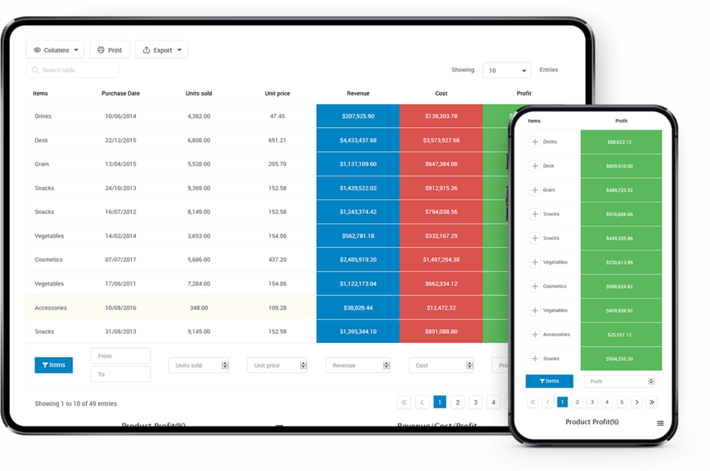
We understand that not everyone has programming skills, that’s why you can use standard features from PubyDoc Data Table and Charts for a table. Data Table WordPress plugin allows building tables and charts easily from scratch. You can manage, customize, and style them without any coding. The best part is the tables are responsive default so they can be usable and readable on any device. What’s even more, you can decide which columns should be hidden and which ones should be visible on different devices. There are 4 responsive modes available for usage.
Standard Responsive mode
By default, the standard responsive mode is set in the plugin. The option makes the column be located under each other.
Automatic column hiding
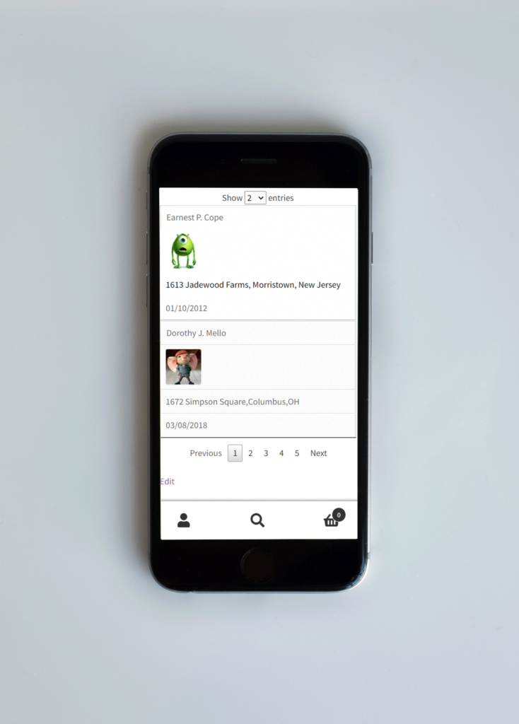
This option will collapse columns from right to left if the content does not fit to parent container width.

Horizontal scroll
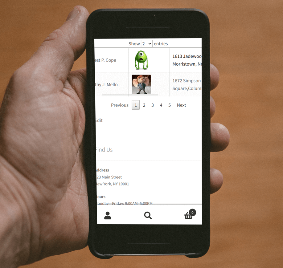
This option adds a scroll bar if the column content overflows the parent container width.
Disable Responsivity
If you disable the responsive mode then the standard responsiveness from the theme you are using will be applied.
No matter what is the main topic of your website, a table is a powerful tool for organizing the content to make it more attractive. Sadly a lot of tables don’t have the responsive option by default. Fortunately, if you are using Data Table and Charts plugin to bring tables to your website, you can create fully adaptive tables.