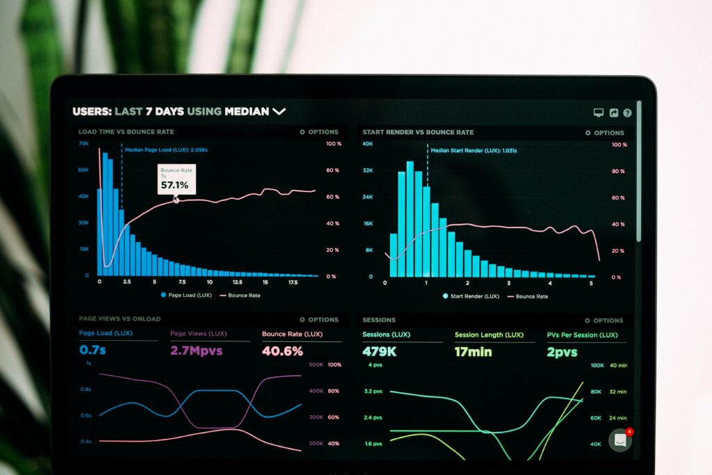
After creating a data table, there is often a need to compare tabular data, establish the characteristics of certain processes, identify patterns of change, and so on. Most often in such cases charts are used for a visual representation of data.
A chart is a type of graphical representation of data that is made with the use of symbols. Bar chart, pie chart, line chart is various types of charts. An elaborated, vast data can be translated into a chart that is comprehensible and easily recognizable.
Charts are created based on information presented in the form of a table. Numeric values or dates are represented with the help of such graphical elements as columns, points, circles, etc. In addition, most charts contain not only graphic elements but also the text that explains the content of graphics. In particular, such elements are titles and coordinate axes, legends.
Graphs are used widely in the field of mathematics. It illustrates data in a pictorial representation where the mathematical connection can be recognized easily.
Comparison Between Chart and Graph

A chart represents data or information with the help of a bar, pie, or slice. It is most useful in a business presentation. Some popular charts are pie charts, bar charts, and histograms.
The graph represents the mathematical relationship between various data with the help of dots, lines, and bars. It is used mostly for analytical fields. Line graphs and bar graphs are the two most commonly used graphs.
Charts are made to categorize data and graphs identify patterns and connections between the data.
This article will provide a comprehensive list of charts and graphs you can make with PubyDoc Data Table and Charts.
Area Chart
This particular type emphasizes the amount of change over a period of time, showing the sum of the values entered. Also, it reflects the contribution of individual values to the total. It is also used to find the best combination of two data sets.
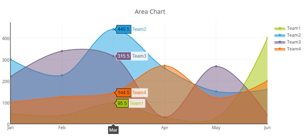
The area chart from PubyDoc Data Table and Charts plugin can be customized easily in the settings which allow checking any changes in real-time in the preview mode where you can hide/show the legend, and change its location easily by dragging and dropping. Besides, you can change the lines and markers, colors, etc.
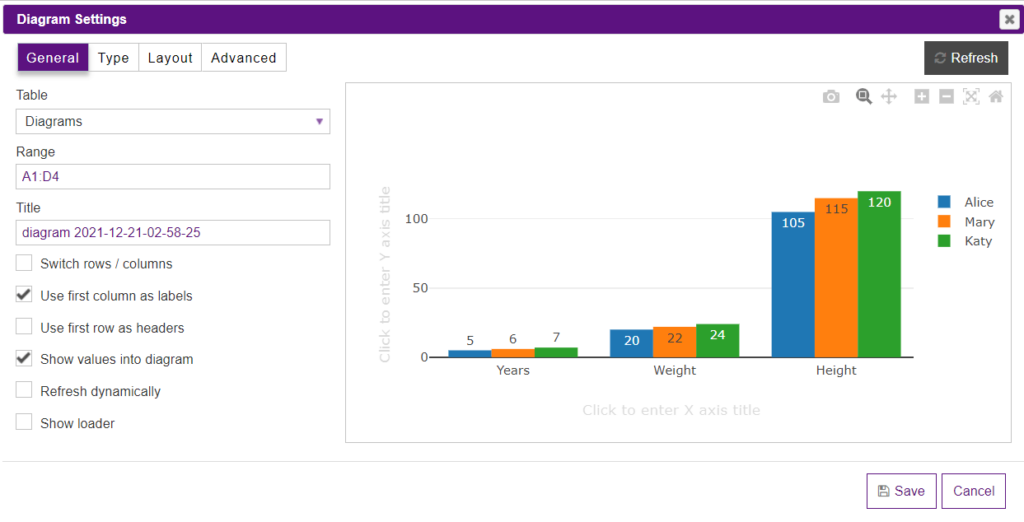
Bar Chart
This is the default type of chart which shows the change in data over a period of time and illustrates the relationship of individual data values. Categories are placed horizontally and values are placed vertically.
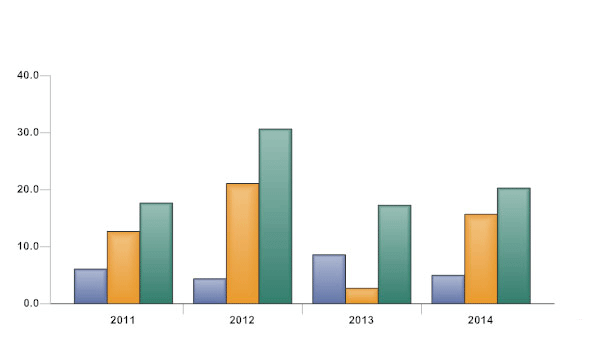
You won’t spend much time setting up the bar chart with the help of the Data Table and Charts plugin because everything is clear and user-friendly. Besides, you can even print the chart while on the settings page. To learn more about bar chart customization you can check this guide.
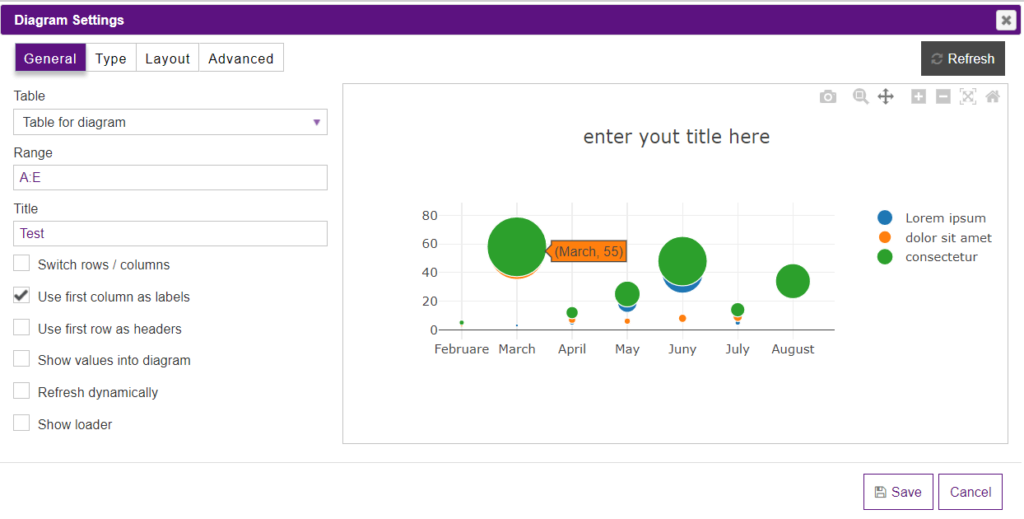
Bubble Chart
The bubble chart displays the relationship between the values of several series of numbers. Often used to present scientific data. When preparing data, you should place in one row (or column) all the values of the variable X, and the corresponding values of B – in adjacent rows (or columns).
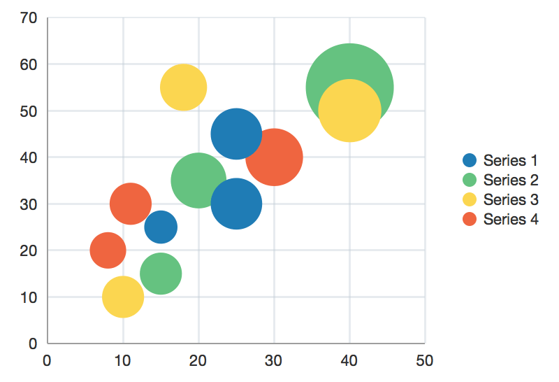
Besides changing the location and the text of the legend, you can also decide on the type of bubble in your chart.
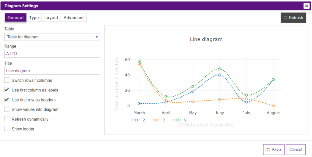
Line Chart
It has the form of discrete points with lines. It is used to display changes in data over time. This type of chart is used to reflect trends of data change over time. The line chart in the Data and Chart plugin has not only colors and font customization settings, but here you may also change the line types e.g. linear, spline, hv,sv.
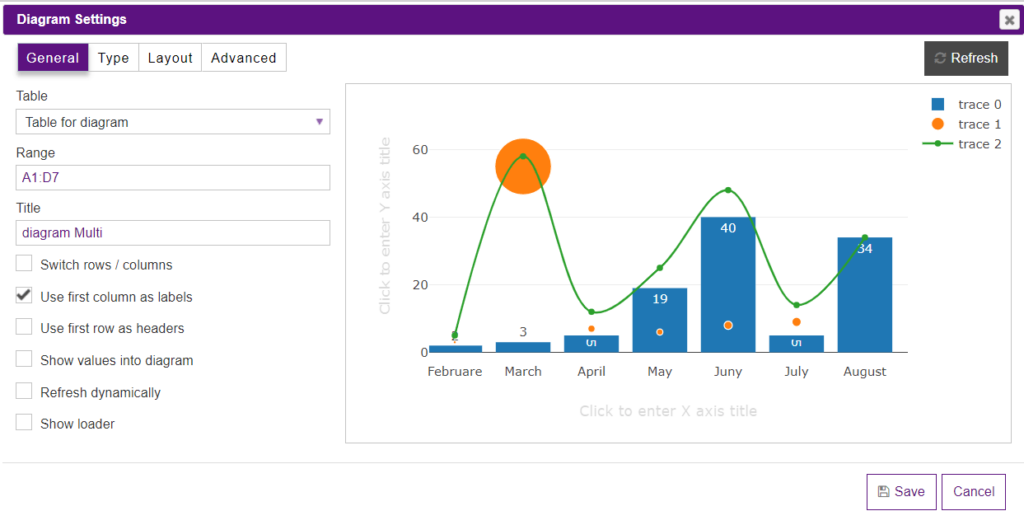
Multi Chart
Multi charts provide options for creating multiple charts. The charts can be of the same or different types and can include different variables from the same data set. Such type is usually used to display ups and downs for the data set. If you decide to use the multi chart, the Data Table plugin allows you to combine in it each type of chart the plugin has.
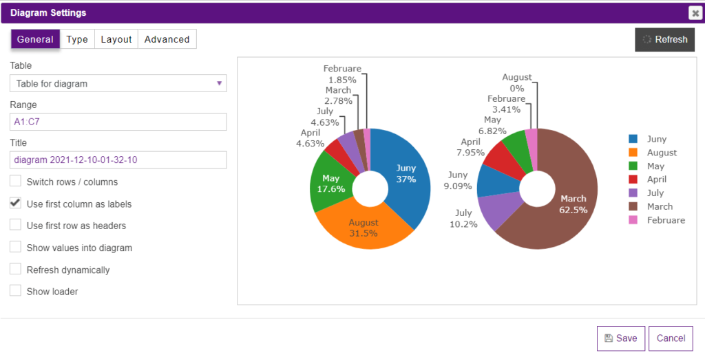
Pie Chart
It shows the contribution to the total. Only one row of data can be represented on a pie chart. A pie chart shows how a total amount is divided between levels of a categorical variable as a circle divided into radial slices. To use a pie chart, you must have some kind of the whole amount that is divided into several distinct parts. In the pie chart, you may set the doughnut hole and the direction of the values. Text position and orientation are also available in the settings.
To sum up, we can say that there is a slightly noticeable difference between charts and graphs. It is in the way the data is compiled and represented. Graphs are usually focused on raw data and showing the trends and changes in that data over time. Charts are best used when data can be categorized or averaged to create more simplistic and easily consumed figures.
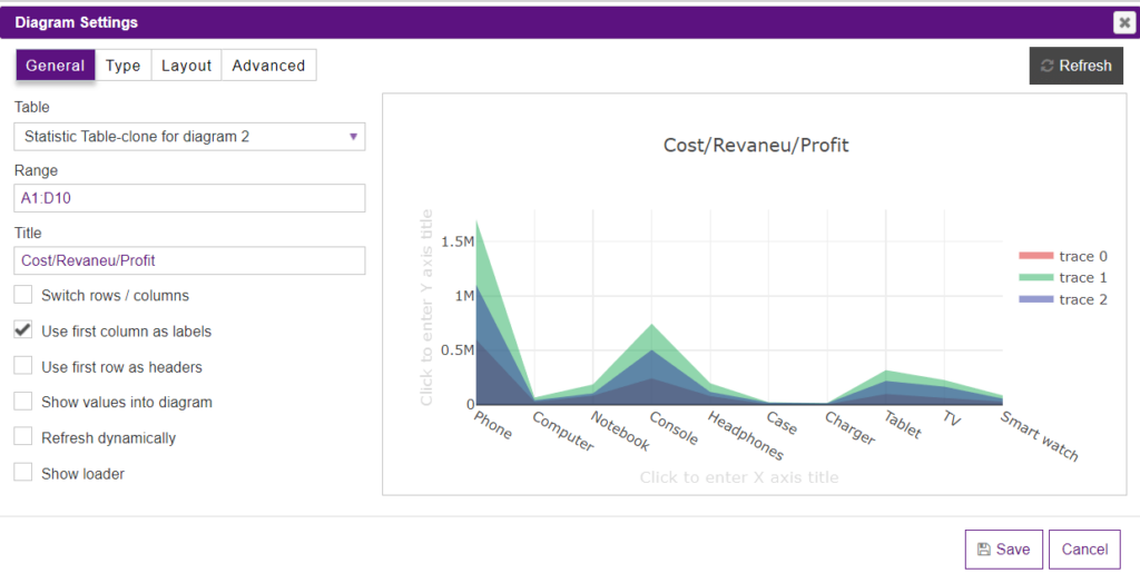
You can choose any type of statistics output and the PubyDoc Data Table and Charts plugin will make it easier for you to output and configure data. To find out how to succeed in the process of customization, you can check our detailed documentation.