The heatmap is used to display data with different representations of colors. Various scenarios in a business process can be considered using a heatmap table in terms of the number of products that exceed expectations or the number of products that fall short.
A heatmap is a graphical representation of numerical data, where individual data points contained in the data set are represented using different colors. The key benefit of heatmaps is that they simplify complex numerical data into visualizations that can be understood at a glance. For example, on website heatmaps ‘hot’ colors depict high user engagement, while ‘cold’ colors depict low engagement.
You’d probably think that the creation of a heatmap is a complex process that requires lots of time, however, that’s not true. With the help of the PubyDoc Data Table and Charts plugin, there is no need to touch any piece of code. In this article, we’ll walk through the process of creating a heatmap.
How to Create Heatmap?
To start with you need to create a table. You can check the step-by-step guide here. With the Data Table plugin, you have an opportunity to import the ready-made table. So if there is already the information you need to use, you can easily insert it into the plugin.
When you are ready with the table, you need to set the conditional rules for the data to create a heatmap. The plugin allows setting the rules for text or numeric column formats. You can find out here how to work with conditional settings.
Let’s create the statistical data for the death case in different countries per year. If there are more than 5,000 hundred death cases, we mark it a red color, for more than 10 000 we’ll use yellow color, and more than 20,000 cases column is marked as black. Here how the conditional settings will look like:
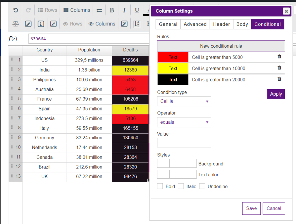
Here is the end result:
| Country | Population | Deaths | Confirmed Cases |
|---|---|---|---|
| US | 329.5 millions | 639,664 | 422,943 |
| India | 1.38 billion | 12,380 | 10,415 |
| Australia | 25.69 million | 6,458 | 1,482 |
| Philippines | 109.6 million | 5,453 | 3,142 |
| France | 67.39 million | 106,206 | 49,217 |
| Germany | 83.24 million | 130,450 | 56,928 |
| Spain | 47.35 million | 18,579 | 75,497 |
| Indonesia | 273.5 million | 5,136 | 3,459 |
| Italy | 59.55 million | 165,155 | 54,581 |
That’s pretty much it!
As you can see the heatmap can be easily created in a few clicks. You now have a table heatmap where you can compare data values. As with the other table, you now need to add an automatically generated shortcode to the page. Adding shortcodes is a very easy process in WordPress.
Table Heatmap Examples
Let’s find out the other samples of heatmaps created with the Data Table and Dat Charts plugin.
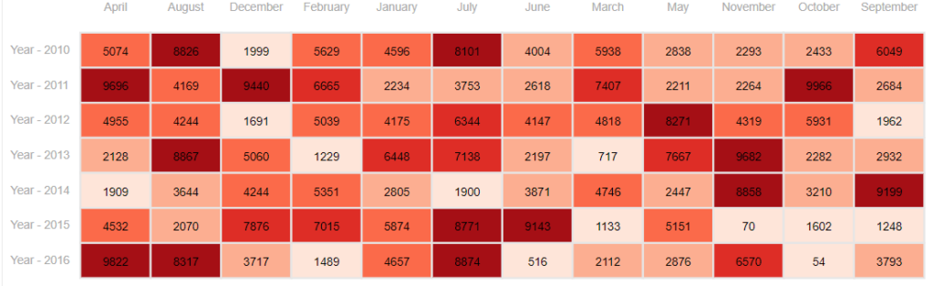
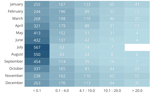
You can showcase products sales by year/month:
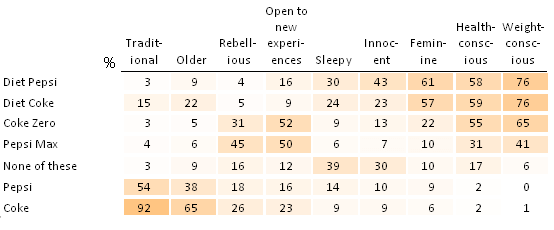
Heatmaps are also suitable for creating brand association:
Besides, heatmaps created with Data Tables and Charts plugin are useful for displaying the number of precipitation:
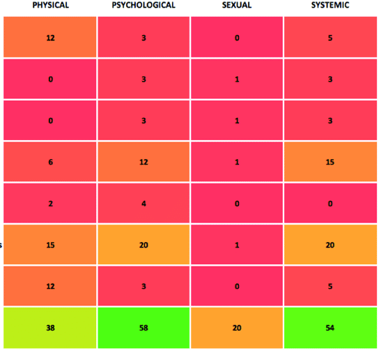
Heatmap can be also used for indicating the percentage of evidence:
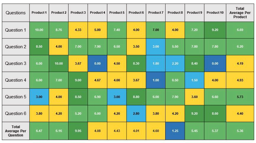
Or business analysis:
To sum up, the heatmap is a common chart type that is used to distinguish the spreadsheets with a large amount of numeric data.