Visual representation of the content helps users to understand data quickly no matter if you are running e-commerce or any other type of website. When you are using a chart or a table for your report or presentation you’ll automatically gain authority and clarity.
But the question is what’s better to use for understanding the data table or a chart? There have been debates about the relevance of usage of charts and tables in WordPress since it was founded, so let’s figure it out. This article will discuss the differences, importance, and fields of usage of both charts and tables.
Is There Any Difference Between a Chart and a Table?
Simply speaking if you see rows and columns, then it’s surely a table. And if there are graphical forms with bars, lines, arrows, etc. it’s a chart.
Charts
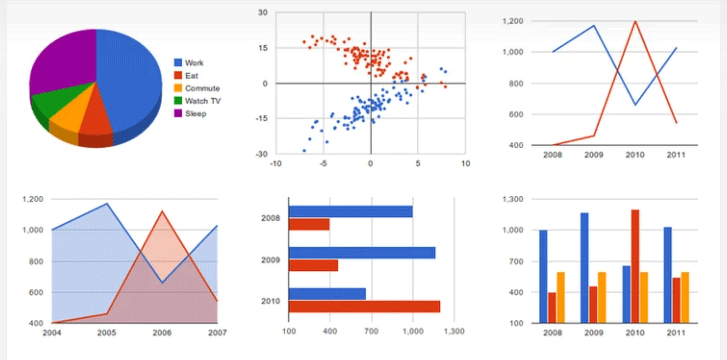
The main task of a chart is to display data thus inviting further exploration of a topic. Charts are used in situations where a simple table won’t adequately demonstrate important relationships or patterns between data points. There is an abundance of types of charts for any taste such as histograms, bar diagrams, pie charts, and line charts.
Сharts Usage in WordPress
Each type of chart has a different use.
- Line graphs are effective at showing trends over time and relationships between variables.
- Bar charts are good for comparisons. The bars can be vertical or horizontal. You can make them different colors to help the reader to differentiate the results.
- Pie charts show the proportion of the whole that is taken by various parts.
- Area charts show changes over time (based on line charts).
- Venn charts show the overlaps between sets of data. It is a good choice when you want to convey either the common factors or the differences between distinct groups.
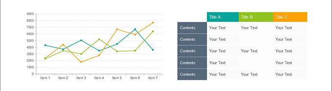
The PubyDoc Data Table and Charts plugin also has multi and bubble charts and it allows creating and customizing any sort of charts depending on the data and your intention.
Tables
Tables are useful for precise numerical, multimedia, and text data. WordPress tables are useful for presenting various structured information such as pricing information about a product or service you sell, a list of people (staff, clients, partners) along with their data, or for sports lovers, the standing of teams on league tables. So if you are organizing the content in a table, it makes it easier for users to understand the info.
Using Tables in WordPress
Everyone knows what tables are used for, so you won’t find out anything new. Regular plugins for WordPress can display the list of team, product details, book catalogs, pricing tables, etc. One of the most common reasons for table usage is to show the details of the product. So, you can hugely simplify the customer’s life if you put the comparison data of several productions in a table.
Here is the list of key points of how tables can help:
- data organization in a visually appealing form
- large data becomes responsive for all devices in a table
- a user becomes involved in data quicker
- easy data search
Because there are a large number of different plugins for creating tables in WordPress, the list could be endless. With the help of PubyDoc Data Table and Charts, for example, you can highlight specific cells, add all types of data (numeric, textual, or multimedia), up to millions of rows/columns. Besides, you can hyperlink a text, image, or button, add multimedia, and color the table too. It has an extensive amount of facilities for new and advanced users.
| Beginning | Basic | Professional |
| $99 | $129 | $199 |
| 1 domain | 3 domain | Unlimited Domain |
| 1 year premium support | 1 year premium support | 1 year premium support |
| 1 year of monthly updates | 1 year of monthly updates | 1 year of monthly updates |
Charts vs Tables
Whether we should go with charts or with tables is still a matter of debate since both forms have unique features and purposes. A few facts can clear up whatever confusion you have about charts vs tables.
There are several questions you should consider before deciding on a table or a chart. Firstly, you should ensure you know your audience well. Secondly, consider your content form. For example, if you are posting an official document, it’s better to use a table. In case your content type is informal, you can use a chart. Finally, if you need to post product data, a table comes in handy.
So the only difference between using a table or a chart is how your information will be structured and how it will look for a user for better understanding. Besides, there is a time when you can use both a table and a diagram. If you put the same data in a table and a chart you can increase the website rating since for some it’s better to understand the data in a table while others find it more convenient in a chart.
WordPress Plugin Example
PubyDoc Data Tables and Charts is a fully responsive WordPress plugin used to create a variety of dynamic data tables and charts. Its advanced functions and user-friendly interface make the process of creating data tables and charts simple and efficient and for users convenient and adaptive on any type of device. Data table with Graphs and Charts is a plugin that allows you to create data tables step by step for any purpose, without programming skills, using a Builder convenient for you.
The best part is that users can design and configure tables and charts effortlessly. You can color tables and charts and customize all you need. After finishing, copy the shortcode and paste it anywhere on your website. The plugin provides you an opportunity to create tables as well as charts without the need to install a separate plugin.
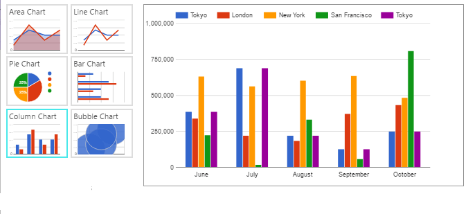
Area Chart
With the Data Table and Chart plugin, you can show how one or more quantity(s) change over time in an area chart.

Bar Chart
With the help of PubyDoc Data Table and Charts, you get access to another type of graph that shows relationships between different data sets is the bar graph.

Bubble Chart
A bubble chart is used to look at relationships between numeric variables.

Line Chart
For showing trends and for identifying whether two variables relate to one another you can try a line chart from the plugin.

Multi Chart
Having at your disposal multiple diagrams from the plugin you can facilitate comparison between more than one phenomenon.

Pie Chart
Data Table and Charts plugin allows creating and styling up pie charts that compare parts to a whole.

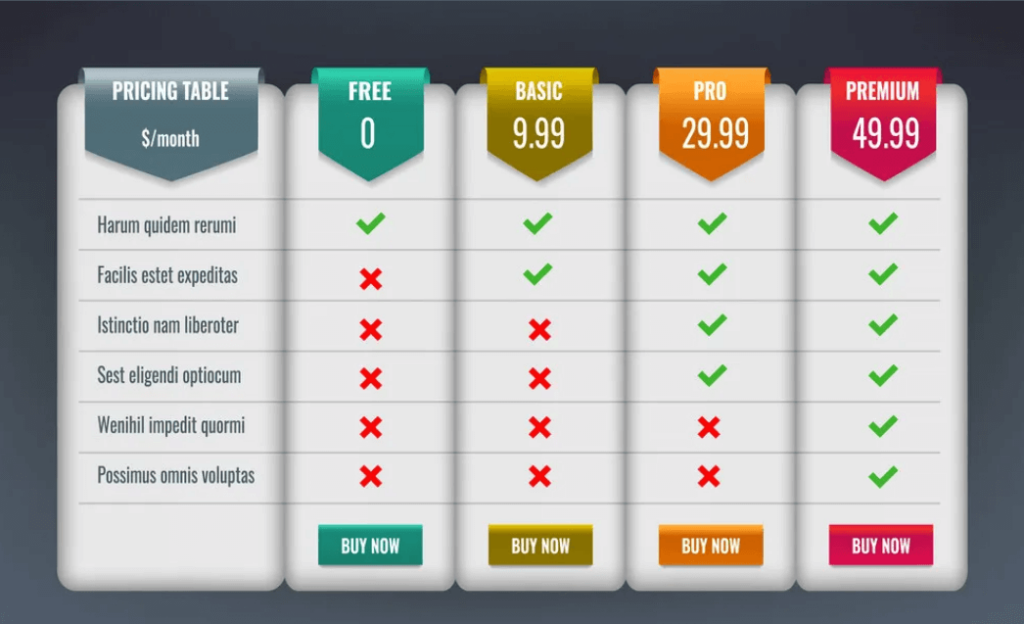
Pricing Table
If you are running e-commerce, you can use the Data Tables plugin to showcase products data in a customizable pricing table.
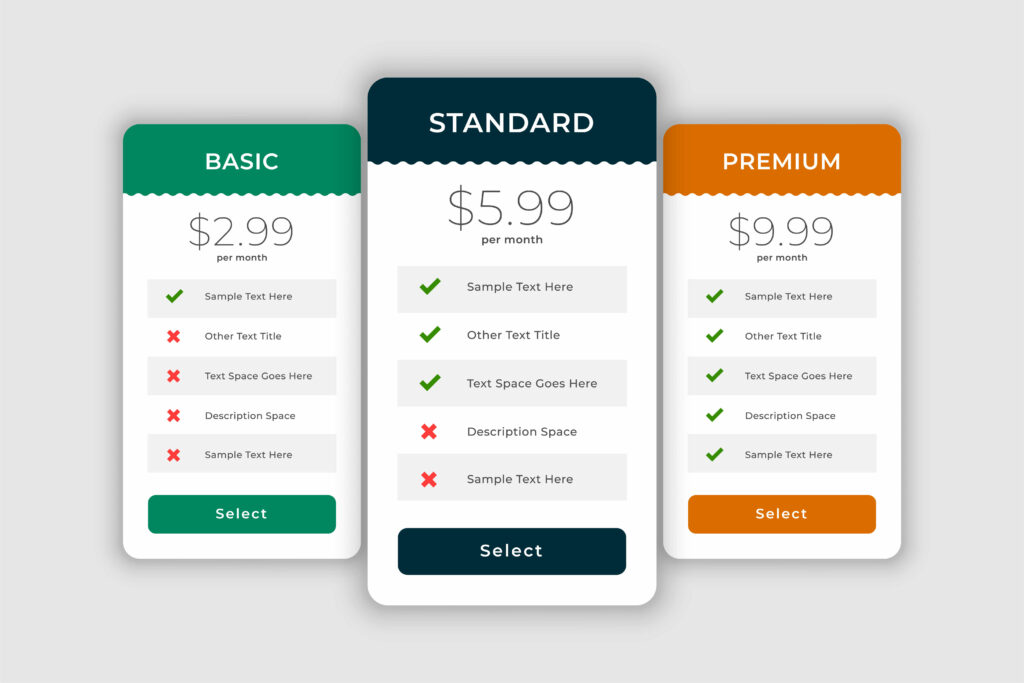
Comparison Table
Besides, you can compare products in a comparison table using the plugin.
To sum up, both charts and tables bring only benefit to your website when showcasing attractively customizable data.