If you want lots of people to read your Facebook post, what will you do? You’ll probably add an interesting picture or photo. This trick works great with reports and statistics data as well. Information in graphical form attracts more attention because it is easier to perceive and helps to convey your message to the audience faster. With the help of visual graphs even complex data sets can be made understandable.
Why does that happen? Because most people in the world are visuals. And if you want more people to visit your website and interact with the data, you need to turn boring tables into beautiful and dynamic graphs.

Competent data visualization will bring your business some benefits. For example, it becomes easier and faster for a user to conclude by looking at a chart where one of the columns or one of the points of interaction is much higher than all the others than to scroll through several pages of statistics through table pages. Besides, a perfect visualization engages readers. Beautiful bright graphics with a clear message will attract the attention of your readers.
There are many ways to visualize data. In this article, we will talk about graphs and charts. Illiterate use of even the simplest charts can spoil the impression of a website. To prevent this from happening, stick to the basic rules of data visualization.
Proper Selection of the Types of Charts
The main purpose of visualization is to simplify and speed up the perception of information. The selected format and type of chart should contribute to this factor and not vice versa.
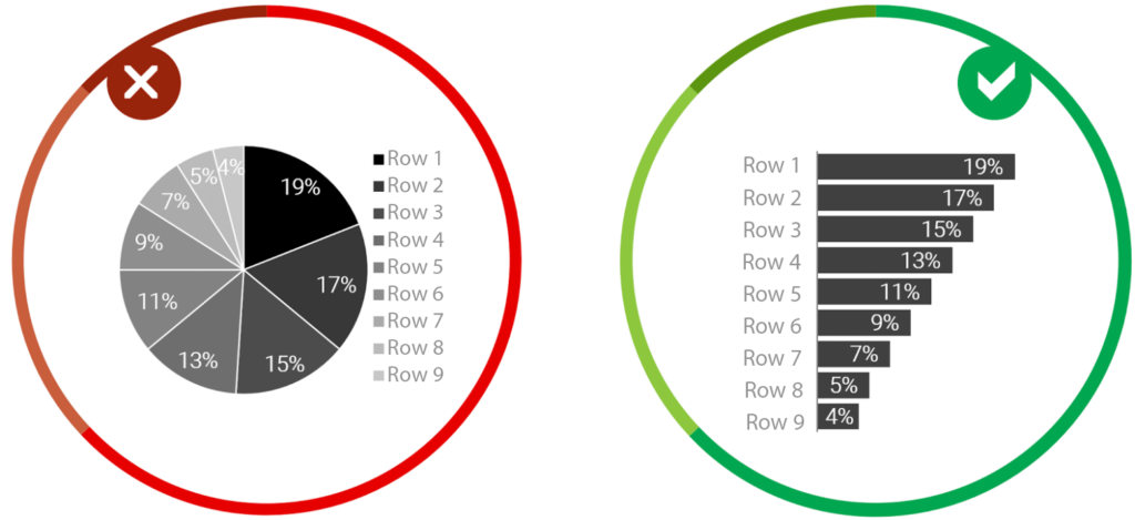
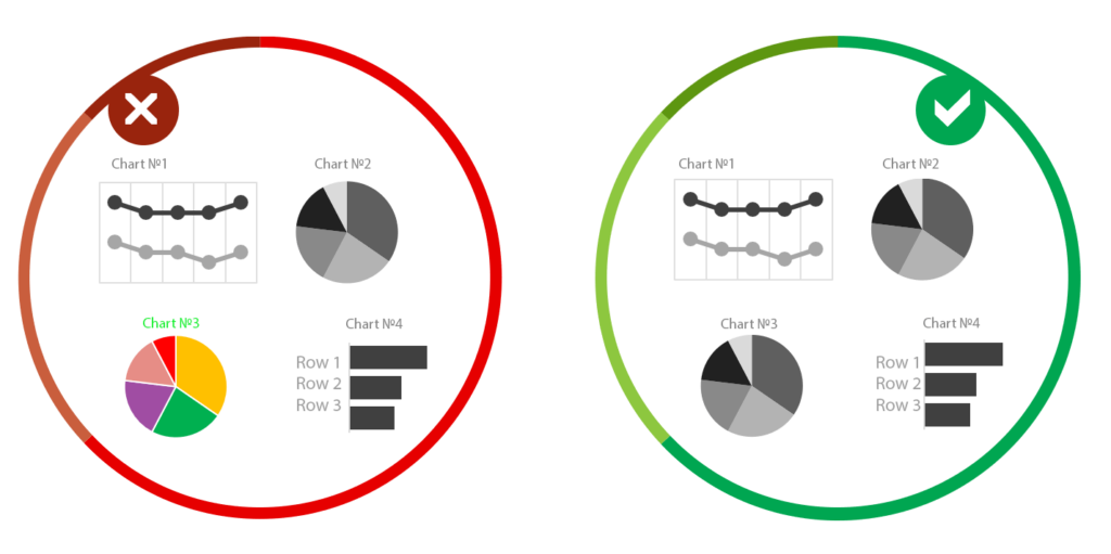
For example, if there are more than three to five values in a pie chart, the graph becomes unreadable. In this case, it is better to choose a regular bar chart. Another example of unsuccessful use of a pie chart is when the sum of the categories is not equal to 100%. This is a gross mistake since the data is simply distorted.
It is equally important to ensure that generally accepted standards are not violated. Time axes (years, months) should always be horizontal from left to right, this is intuitive. If they are arranged vertically from top to bottom, this will greatly complicate perception. That’s why the devs of the Data Table and Charts plugin create fully customizable charts where you can easily change the location of any elements of the chart such as legend, axis, title, and so on.
Place Data in Logical Order
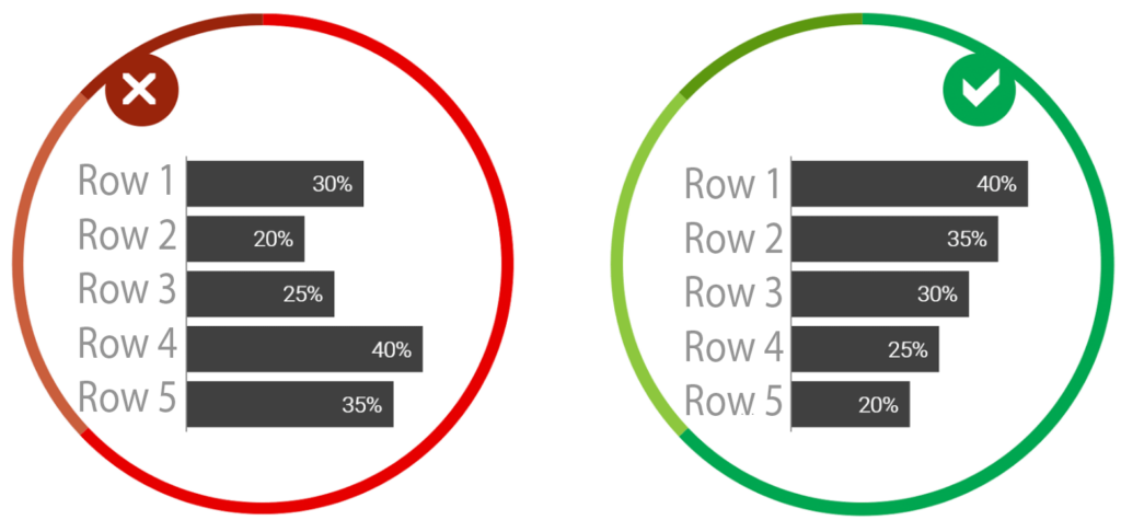
Be sure to arrange the data in a logical order. Most often this is sequentially from largest to smallest. If you show the results of a survey on a diagram, where there is a division into positive and negative answers, then it is more logical to arrange them like “Yes, Rather yes, No, Rather no, Difficult to answer.” Data can also be arranged from smallest to largest. Before you start building a chart, clearly articulate what idea you want to convey to readers, what you want to draw attention to. In the settings of charts created with the Data Table and Chart plugin, you are free to align the items according to your need in the styling settings.
Use Understandable Data Formats
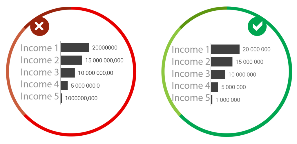
Numbers must be with digit separators and without extra decimal places. In large numbers, always separate the digits e.g.10 000 000 not 10000000 otherwise the numbers become unreadable. Don’t use decimal places unreasonable. If you decide to show one decimal place, then do this for all numbers, and not selectively. Data Tables comes with built-in functions that allow users to change the format of date, time, and other numeric values. You can modify your format by going to Options » Main in the plugin admin area and scrolling down to the Data formats section.
Titles and Signatures
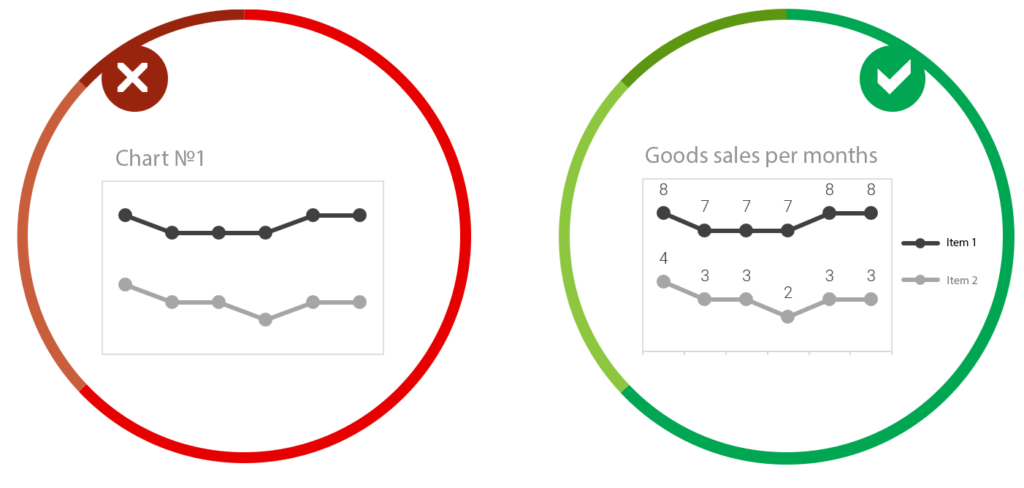
The chart must have a title and a legend. Make sure that your diagram always has a fully understandable title and all the necessary captions, otherwise, there is a risk of misinterpretation. Don’t rely on that a user guesses the info from the context. Everything should be extremely clear, a visitor should not have a single doubt about the interpretation of the data presented. While you are setting up your chart, you can easily change the title, the name of the axis, and the legend in the preview mode.
Keep One Palette
Stick to one color scheme. Visual elements (graphs, diagrams, diagrams) should be made in the same color scheme. If you are running a website for a research company, then the color palette should be the same in all studies to comply with the corporate identity. If you supplement your report with graphs from other studies, they must be redrawn, otherwise, they will strongly cut into the overall picture and spoil the perception. Firstly, they probably have a different color scheme, and secondly, often the quality of the pictures is not the best and this is immediately evident.
Don’t ignore these simple yet very important visualization rules. Take care of your visitors. Even though WordPress has a huge number of advantages, you can be sometimes limited in the settings. Our team creates a Data Table and Charts plugin that can simplify the process of creating and styling eye-catching charts. There are a lot of different types of charts, so, you can use any of them.
Among the mentioned option, the plugin also has such features: